
We humans have to make choices or choice in every aspect of life. Whom to marry, which carrier to choose, which college should I study, and many other things.
The same thing happens in the digital environment. The only difference is it is packed with much more distraction. For example, we have many choices for one product: If I want to buy a photo editing tool. You will see that there are already more than 15+ tools are in the market. And what should you choose and what doesn’t is very hard. In this article, I had talked about how to present and influence choice so people will choose your product rather than the competitor!
Before you move further
I would like to know why you choose to read this article rather than reading another article or choosing to watch Netflix or going for sleep? Maybe You acknowledge the 10-15 reasons, but there are still plenty of reasons you are unaware of.
Don’t believe my words. According to research, an average person made 200 to 300 decisions regarding food consumption on any given day (Wansink and Sobal 2007). So, If we are making such a tremendous amount of decision to eat food, then think for a second how many decisions we took to do other things(in this case, reading this article).
Anyway, we will learn how we humans decide if I talk more precisely, then we will learn how and why we choose options among other options(in behavioural science, we call it choice architecture).
But first, we have to put some critical equipment under our belt to take full advantage of this article
Let’s start with what is Nudge so that we can understand what choice architecture is
Nudge is about redesigning the physical, social, and psychological aspects of the context in which the decision occurs to promote the desired behaviour.
Nudge is such a powerful thing that even United Kingdom Prime Minister David Cameron recently spent £520,000 to fund the Behavioral Insight Team (informally referred to as the Nudge Unit).
This is done by integrating insights from social psychology and behavioural economics to overcome the biases that might be in the way. Last, Nudges are only external, which means we can touch or see them.
What is not a nudge?
Most people still take the Nudge in the wrong way. They think if someone is using psychology or any behaviour economics, then it nudges. No, it’s not a Nudges. That’s why I decided to give an example of Nudge.
An example of what does not a nudge is:
The website Stickk.com, which was created by fellow economists. It lets people back up their goals with financial or nonfinancial incentives. For example, if you want to stop wasting money on happy-hour wine, you can put up $100 in the website wallet.
If you achieve the goal, you keep the money. If you don’t, then you pay it, either to a charity or to another recipient of your choice.
At first glance, it will look like a Nudge but let me makes thing clear
This is not a nudge because it provides an incentive( similar to watching videos on Facebook or a smoker who smoke a cigarette that elicits dopamine in the brain).
It also gives punishment when the goal is not completed(in the form of sending your money to charity). You can see that we are not doing anything with cognitive bias. If you see it closely, you will find that nothing is happening externally. Which is a sign that it’s not a nudge
An example of right Nudge

In a Lake Shore Drive, a roadway. One particular segment includes a series of S curves that require drivers to slow down to 25 mph. Many drivers ignore the posted sign that states the reduced speed limit. They are either easily distracted by the scenery or cannot assume how tight the curve is(obviously, if people didn’t pass the road, how can you make assumptions), both of which may result in accidents.
By introducing a new way of nudging drivers to slow down, these accidents’ individual and societal costs have been reduced.
So, this how scientist did it! Immediately after passing a warning sign, drivers encounter a series of white stripes painted onto the road. Thaler and Sunstein describe this interface as a prompt that inclines drivers to slow down: When the stripes first appear, they are evenly spaced, but as drivers reach the most dangerous portion of the curve, the stripes get closer together, giving the sensation that driving speed is increasing.
It results in alerting the driver insights to slow down. Wow, what a great example of Nudge. Is not it?
I hope the Nudge concept is clear now
Let’s understand choice architecture which is a core part of Nudge
What is a choice architecture?
It was coined by Thaler and Sunstein (2008), “that reflects the fact that there are many ways to present a choice to the decision-maker, and what is chosen often depends upon how the choice is presented. “
In simple terms, you can understand choice architects like a physical architecture of a building that affects the people who live inside it.
For example, I am a sluggish person who doesn’t love to do physical work. At the same time, I want to do exercise for staying fit. So, I instructed my architecture to build my toilet on the 3rd storey now.
Imagine how many calories I will burn whenever I go to the toilet from the 1st floor to the 3rd floor.
Before we learn the practical implementation of choice architecture. It’s essential to know about your target audience because sometimes it backfires also.
Enough theory, let’s talk about practical implementation
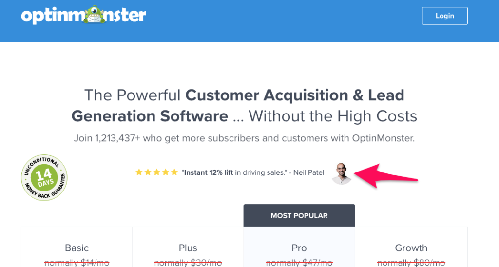
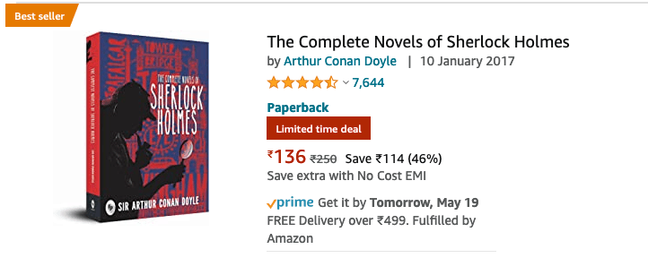
1) Don’t present alone options. Present it with some social proof
In an experiment, the scientists want to increase the use of reusable towel in a hotel. So, they came up with two different messages.
The first message was designed to reflect the industry-standard approach and focused the guest’s attention on the importance of environmental protection. Here is the message “HELP SAVE THE ENVIRONMENT. You can show your respect for nature and help save the environment by reusing your towels during your stay.”
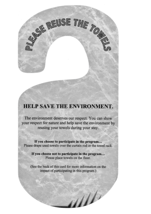
The second message used social proof, informing guests that the majority of other guests do, in fact, participate in the program at least once during their stays participated in the towel reuse program.
Here is the original message “JOIN YOUR FELLOW GUESTS IN HELPING TO SAVE THE ENVIRONMENT. Almost 75%of guests who are asked to participate in our new resource savings program do help by using their towels more than once. You can join your fellow guests in this program to help save the environment by reusing your towels during your stay.”
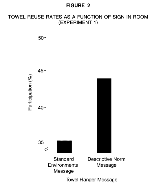
Both messages get printed on signs and positioned on washroom towel racks. The results showed that the social proof sign(second sign) yielded significantly higher than the industry standard(first sign). Below you can see the stat’s that which messaged worked and which not.
If you might be wondering why this happened, then I published a pdf on my website about it. You can check from here www.khadush.com/#test
In case you don’t want to read, then here is the crucial thing to remember. People tend to follow others’ choices instead of making their own decisions (good and bad) to reduce the cognitive effort when faced with too much information. It doesn’t matter that the information is online or offline.
How can we use it effectively in the digital space?
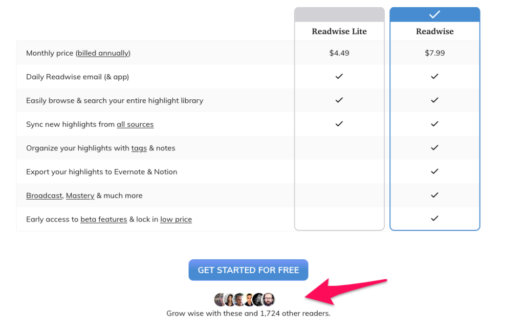
I am sure you knew about reviews and other social proof on the website and other landing pages to help the people choose your product. So, I am not going to give you those generic examples; however, I had found some unique and creative way to show social proofs, which are shown below:
.
.
Be conscious of the environment in which you are presenting the information. As you can see in the example, 1 and 2 both are from the pricing page. So, It’s essential to minimize the distraction of that page because if the distraction doesn’t get reduced, users might end up doing something else rather than purchasing your product, so they are presenting the social proof in a very minimal way.
But if you see the last example you can see there are lots of things going on the pages because there are no one important option
2) We can design the environment in which our user make a choice
Our environment makes a significant impact on our habit and actions. And if we can redesign the context/environment, we can easily change the people behaviour.
For example, In research by Bandura and Walters (1963) have shown so elegantly, children tend to engage in aggression after viewing films in which role models act aggressively. In fact, the primary reinforcement for aggression is the act’s performance by the role model; the aggression needs no other reward.
Similarly, For two weeks, stereotypically French and German music was played on alternative days, and the amount of French wine versus German wine sold was measured.
Additionally, purchasers of wine were asked to fill out a brief survey, the results of which revealed that they were “unaware of the effects of music on their product choices.”
The results were quite surprising, more French wine was sold on days when French music was playing, and more German wine was sold on the German music days.
How can we use it effectively in the digital space?
.
.
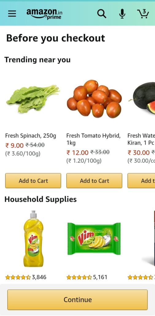
The most important thing to remember here is that you have to remember that at the time of presenting choice according to the environment, Make the choice salience. It means the choice should be visible and capture the user attention without distracting them.
3) Make your message easy to understand and engaged.
Below are a couple of ways you can apply on your messaging:
a) Remove the Abstract language from your copy
I am sure most of you guys don’t like Wikipedia articles, and the reason is simple it contains abstract words which are hard to understand for ordinary people.
Abstractions like these may be helpful for expert communication. But for most readers and listeners, excessively abstract language can be pretty confusing and, frankly, quite dull.
Example: I had googled what is “End-to-end encryption”, and here are the two results which I got:
- When you use E2EE to send an email or a message to someone, no one monitoring the network can see the content of your message — not hackers, not the government, and not even the company that facilitates your communication.
- End-to-end encryption (E2EE) is a system of communication where only the communicating users can read the messages. In principle, it prevents potential eavesdroppers – including telecom providers, Internet providers, and even the provider of the communication service – from being able to access the cryptographic keys needed to decrypt the conversation.
I guess you can spot the differences pretty easily so, don’t use the technical and abstract word in your copy.
b) Don’t use the numbers alone
It can be difficult for people to process highly quantitative information(like numbers) because the numbers are challenging(especially when they are big) or the domain is unfamiliar.
Research shows that numbers become more easily evaluated if broken into categories, such as grades or endpoints clearly labelled as good or bad. The same research also showed that labels facilitated information processing by allowing affective reactions to be accessed more quickly. Peters et al. (2007)
For example, newly proposed EPA labels contain information about carbon dioxide emissions, but no one is familiar with a “good” or bad” level of CO2. The labels try to remedy this problem by rating a given car on a 1 to 10 scale linear in CO2 reduction.
4) People need to feel in control about choosing the option
When I am talking about control, I mean addressing gut feeling, trust, and intuition.
Science has already proven a thousand times that without emotion, humans can’t make decisions. And It will be stupidity if we don’t address the emotions rather than just persuading with logical arguments and product features.
For example, suppose Rohini feels insecure about making a decision(like buying a watch). In that case, your messaging & product should be more about making her feel secure, confident, and safe than just showing about product features.
Let’s see how can we do that
Have you ever landed on a website that wants you to purchase something but your gut feeling is screaming and saying “don’t buy from this website”, or am I sure it is the right website to buy something and many other unwanted questions?
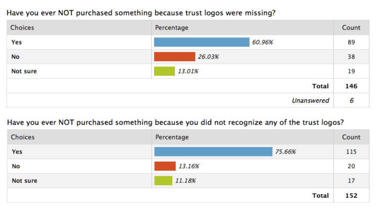
It’s because you don’t have trust on the product website. Now, there are infinite factors that decide whatever a person should believe on the website or not; I want to talk about only one of them, which is trust

Maybe the above paragraph seems not reasonable to you, so I included a survey from shopify.com where you can see that 75% of people didn’t purchase anything due to missing a trust logo.
5) Pros and cons
According to research, People choose between alternatives by weighing their pros and cons on different attributes, and choice architects influence behaviour when particular attributes are made more or less salient. So always highlight the best option
6) Personalized Recommendations
Research has demonstrated that decision aids such as product recommendation systems can be highly beneficial to consumers, enabling them to find products that better match their preferences while at the same time reducing search effort (Häubl and Trifts 2000).
.
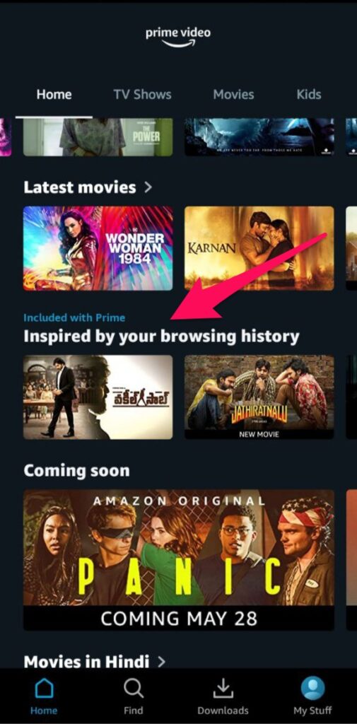
This is the low-hanging fruit that you can leverage at any time. It is used mainly by eCommerce companies, but now other tech giants like Facebook, youtube, Netflix, etc., are using it to make people stick to their platform.
These tools use algorithms that suggest new items based on what people have done in the past. Recommendation engines can follow two basic models of personalization.
The first one is based on products or items. Each item is tagged with specific attributes.
For example, If I search for the book “Atomic habit” since it has a tag of self-help, then an algorithm will find the other item with a similar tag and recommend me to buy it.
The second personalization model is based on people.
A similarity index identifies people who have attributes in common. These similarities can include tens or hundreds of variables to precisely match people to others who are like them in critical ways. Then the algorithm makes recommendations based on items that look like users have chosen. This recommendation algorithm says, “People like you liked these items.”
6) Reduce the numbers of choice
This is the most common tactic and currently used in the different domains, so I don’t think I should talk much about it because you can learn easily about it on google type “analysis paralysis.” The only thing which you have to keep in mind that don’t give lots of option mindlessly to your user.
Give them choice only when they really need it!
Bonus: 5) Limit your meaningless choice
Don’t show choices that are not helpful for the people. Not all choices are meaningful. While users may appreciate it if you give them lots of customizable options, but that doesn’t mean everyone needs it!
It’s not the end
Behavioral science is a field that is evolving day by day, and new research is conducting daily. I will keep this blog updated with fresh insights, tips, and tricks, but that’s all for now. I hope you got some value out of this article.
Let me know your feedback You can reach out to me on Twitter and LinkedIn.
