
This project was done @optiphoenix, and it’s under NDA; that’s why not disclosing the client name.
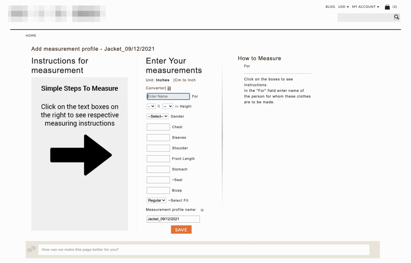
My manager showed this screen to me and asked me to solve a couple of problems with the screens.
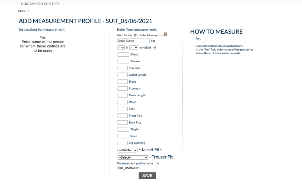
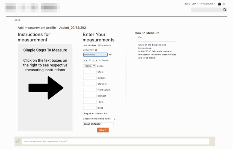
The Problem with this old screen was:
- There were too many things going on this screen which was making users overwhelmed.
- Users were unaware of how to measure the chest and others ( I mean, they don’t know how to take the measurement and which size metric they have to provide measurement, e.g. Inch or CM).
Before we move on to a solution, A little context about the screen.
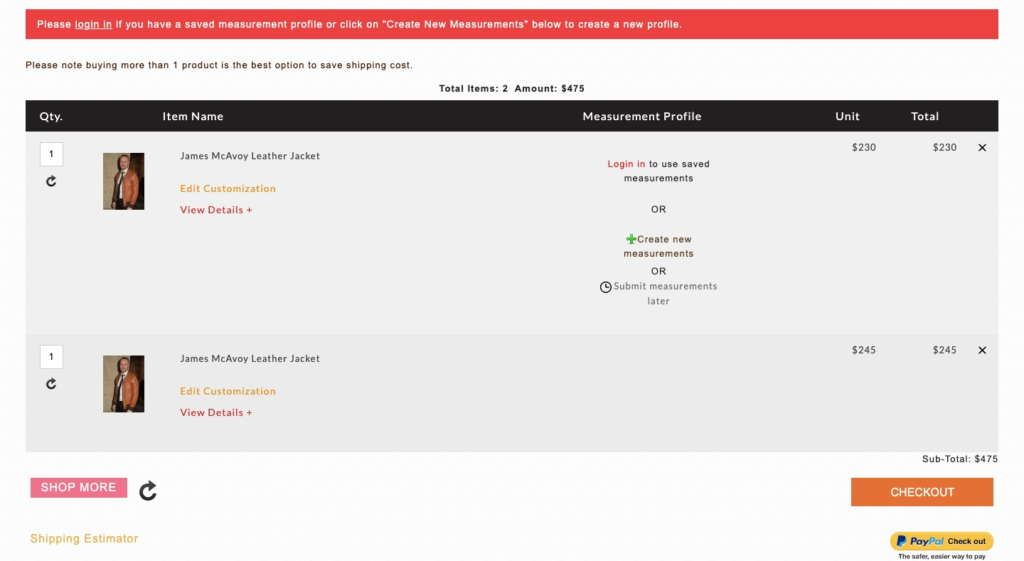
- When users will reach out to the website, they can choose any suit they like, just like we do on amazon.
- But on the cart page, they can provide their custom measuring or directly buy with the pre-build size and fabric.
- So when they click on “Edit customization”, they have to log in and land on the screen shown above.
Constraints
Before judging my solution, it’s essential to talk about the restrictions to understand the context behind my design decision.
- Since the website was built on old CMS, we don’t have enough flexibility to change the layout and other design elements
- We have to mke things look consistent according to the brand and their writing tone!
.
Solution of
Problem1: There were too many things going on on this screen which was making the user overwhelmed.
For this problem, I tried to use the visual hierarchy and deemphasize the other less essential elements first to create a solid visual hierarchy. As well as added white to feel the layout less overwhelm.
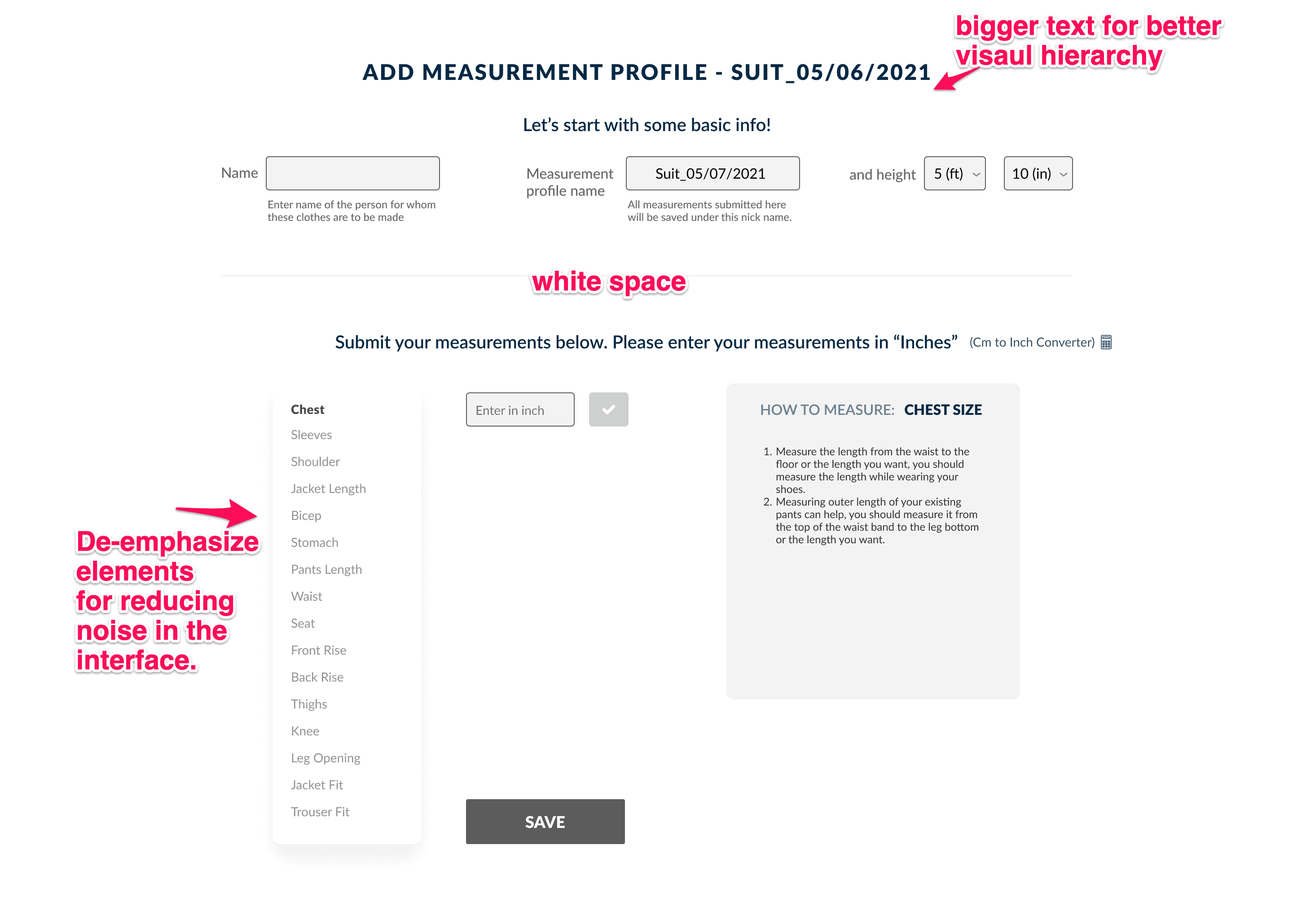
With the addition of white space and hierarchy. I also divided the section into two parts two make the interface perceived as a two-step process.
Problem2: Users were unaware of how to measure the chest and others ( I mean, they don’t know how to take the measurement and which size metric they have to provide measurement, e.g. Inch or CM).
After landing on-page, you can spot the mistake that when first time users who will land on this page will be unclear that how they are going to give the measurement of the chest and in which size.
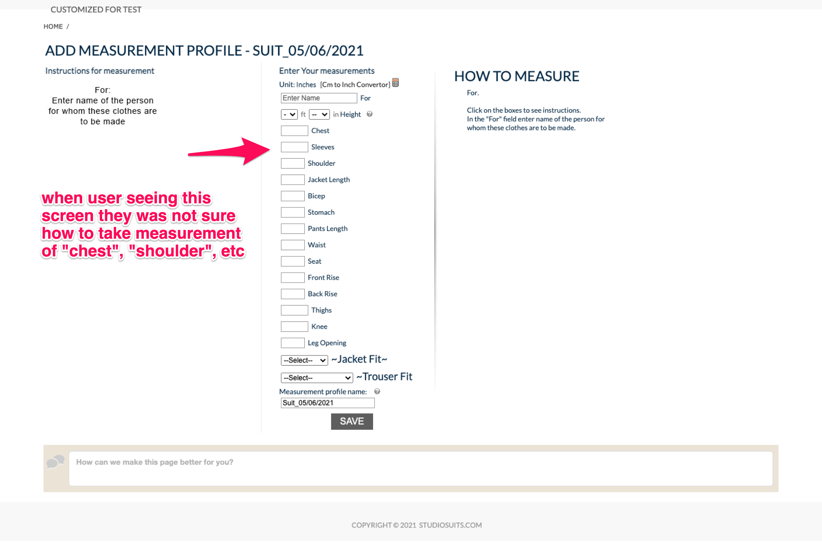
Even though the client had already built the solution to this problem, the process of taking measurements will only show when you click on the input box.
For example, When I click on the chest input field, they will show you how to take a measurement.
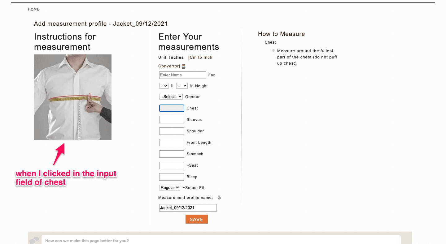
As you can see in the above image when the user clicks on the input field, they will get to see an image of chest measurement, and on the right side, there is a step on how to measure it!
But, the actual problem in this interface was the problem of the trigger.
In the book, Microinteractions by saffer has given that:
A trigger should convey what will happen when the user clicks on it. It means it should be clear upfront even when the user didn’t click on it!
And that’s what this interface was lacking. So, for this reason, I made the trigger more clear up front.
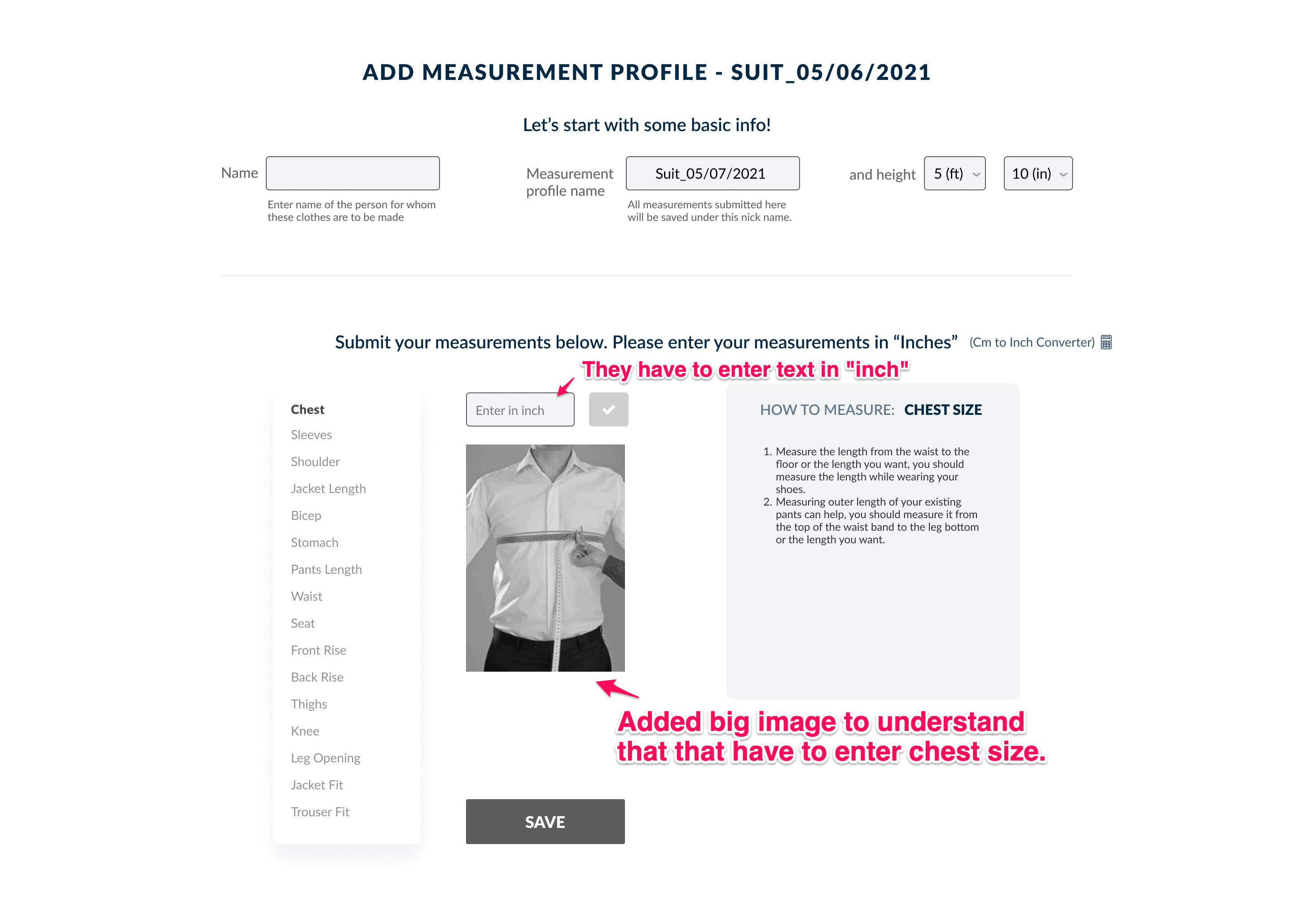
I made the chest image visible so users can understand that they have to take the chest measurement first.
Also, I have added the “inch” in the input field so users can understand that they have to enter the size in “inch”.
I also fixed some interaction problems with this screen.
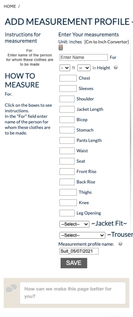
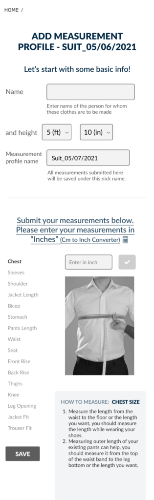
Now, another challenge with the screen was redesigning the screen for the mobile version
Here is the old screen of mobile:
.
Here is my redesign:
Result time
I tried my best to come up with the solution, but it was tough to implement this solution on the live product and hard to do the A/B test.
In the end, we had to drop the idea, and the client had to implement this idea.
Although this was easy to 2implement for the developer and client But, I am sure this will still not solve the user problem 100% because the arrow and microcopy added with it were still unclear.
