
Estimated reading time: 3 minutes
A bit of context
I was reading the “universal principles of design” book, and in its first chapter author is talking about how the 80/20 principle is vital for software and apps.
But I found many apps are still breaking this rule, and many of them are doing good also, so I decided to write about this topic with practical examples and how can we leverage it for better UX.
A bit of the man behind this principle
Vilfredo Federico Damaso Pareto(simply Pareto) an economist and philosopher. He noticed that 20% of the pea plants in his garden generated 80% of the healthy pea pods. This observation caused him to think more. He thought about wealth and discovered that 80% of Italy’s land was owned by just 20% of the population.
He investigated different industries and found that 80% of production typically came from just 20% of the companies.
How Does the Pareto Principle Work?
The Pareto Principle is a concept that suggests two out of ten items on any general to-do list will turn out to be worth more than the other eight items put together.
For example:
- I wear 20% of my clothes 80% times
- I use 20% of my mobile apps 80% times
- 80% of revenue comes from 20% of customers
- 80% of sales come from 20% of sales staff
It is always not true that the number will be 80/20 all the times. It varies from context to context. However, the core of the principle lies in knowing that, 80percent of the effects generated by any large system are caused by 20percent of its variables.
Real-world example:

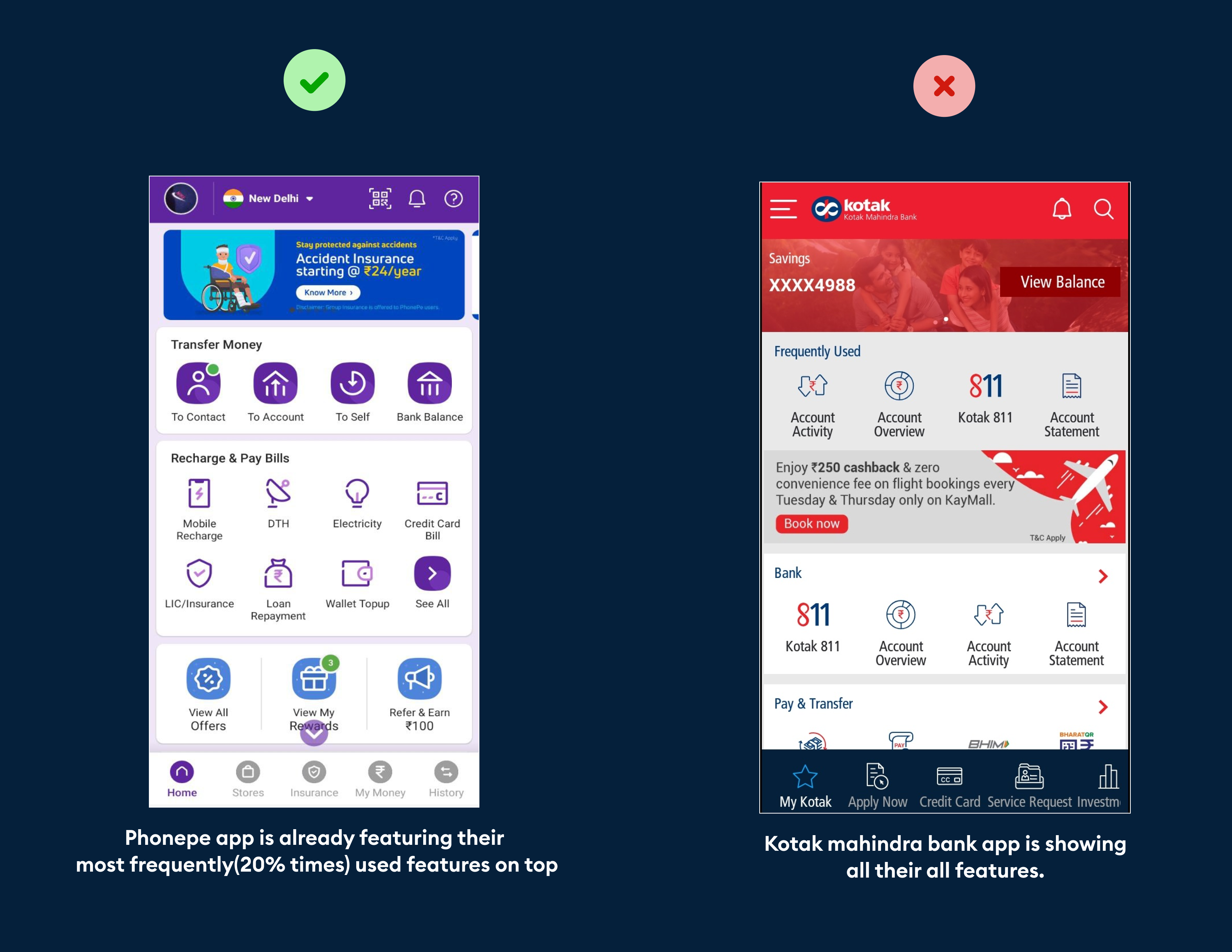
Let’s see why what is wrong and what is right!
Imagine yourself as you are using a payment and answer my question.
What you do mostly with your app?
Here is my answer but I think my answer your answer will also similar to my answer.
I use my app for:
- Sending someone money
- Checking my bank account balance
- Mobile and some other recharge
- Credit card payment
- Paying my bills water and electricity
[cp_slide_in id=”cp_id_1378a”] Now,revert back to above image and compare both image side by side and see which had listed most frequently used feature in their app.[/cp_slide_in]
Another example

Now again think for a second as a user and tell me how many features do you use which are layed out on the bottom screen?
May be you will use one or two features then why the developers are putting those features on the screen?
Again in last I want to say 20% features are used 80% times so focus on that 20% not on 80%.
Thanks for reading
