

Bhumiitech.com is a tech startup. It develops B2B software and provides services in the cybersecurity domain.
Our software includes a learning management system, the cyber range for training cybersecurity professionals and other security products for companies’ “internal security usage”.
Problem
Bhumiitech wants to capture the Indian and international market of cyber security software for that it’s very important for their customers to understand what Bhumiitech do and how it can help them.
It’s not possible to achieve goals with an outdated website which does not look competent, or visually appealing and messaging is very vague.
Who’s is the user
When it comes to cyber security it feels like every company that uses a computer should buy our product and service so, it’s very hard to cherry-pick our industry and target audience.
Still, here are some target businesses which we think are ideal for us:
- Educational institutions that want to train their students with theoretical knowledge and real cyber threats
- Established companies that want to train employees to keep their infrastructure safe by simulating their network and testing it in the real world.
A few other target markets:
- Security Professionals
- Defence & Law Enforcement
- Education Providers
- Large Enterprises
- Banking, Financial services and Insurance
- Health Infrastructure
My roles & Responsibilities
The team consist total 4 people.
- One motion designer
- Two front-end developer
- One designer and content writer
My role was to write copy, design & communicate with all others
As I told you earlier bhumiitech is a startup that’s why we were tight on budget to hire a copywriter.
Since I know a little bit of copywriting I decided to write the copy of all 8 pages by myself.
After writing the copy I turned it into the wireframe to get feedback from stakeholders.
Then, I turned those wireframes into a Hi-fi design.
While I was designing HI-FI design I was also communicating with the motion designer to develop the 3D animation of the website.
After finishing the design I showed the final version of the website with animation to stakeholders took feedback made some changes.
Then hand it off to the developer.
With that, I also take care of the content management system of this website.
Constraints
We were very tight on the deadline and for the website we got only 2 months because after 2 months we were having an important cyber security event so, we have to finish this project before that.
Maybe 2 months sounds like enough time, but, we have to develop motions for our website.
Write content and hard code the website in Reactjs because we were not using any website builder like webflow.com or wix.com.
We were also tight on budget, the team was very very small and there were no previous brand guidelines for the website.
Deep diving into the process
Market research
While the technical director was involved in the project, he still also don’t know about the target audience.
And when you don’t know about your audience, you can’t write for them.
We also need to know which feature is essential for our customers so we can propose our solution correctly.
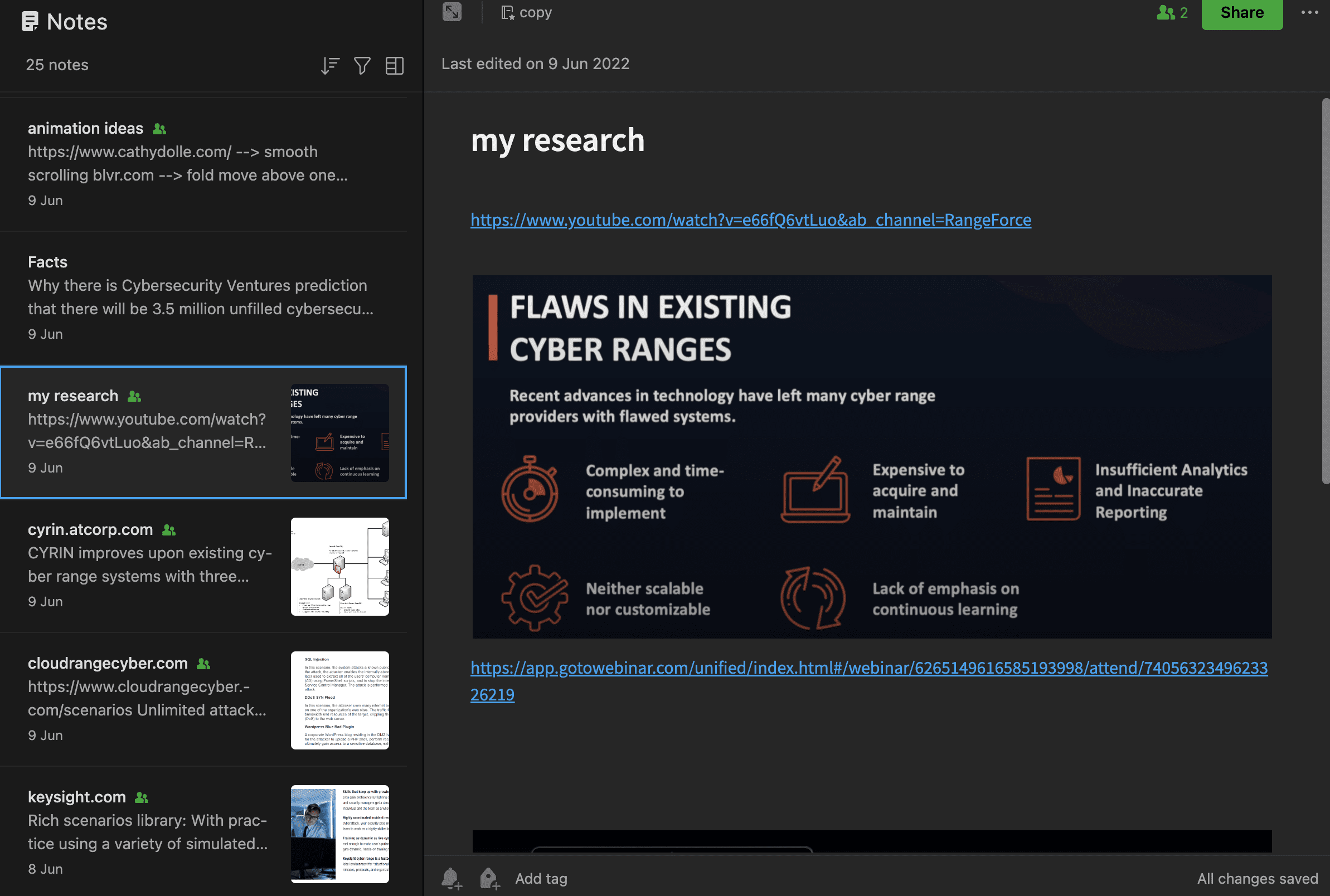
As usual, I started to do the market research and found some competitor websites;
www.atcorp.com/products/cyrin/
The main thing I found on the competitor’s websites was:
- They sell high-value products but need to be more authoritative regarding visuals.
- Their homepage content is written in a way that assumes that the customer is already aware of the solution entirely.
- Since we are selling to Indian clients so, on our homepage, we need to talk about the problem than a solution.
After research
After market research, I wrote the copy directly in the wireframe.
I don’t want to extend the case study, so I will not talk about how I wrote copy. You can check the wireframe and content here.
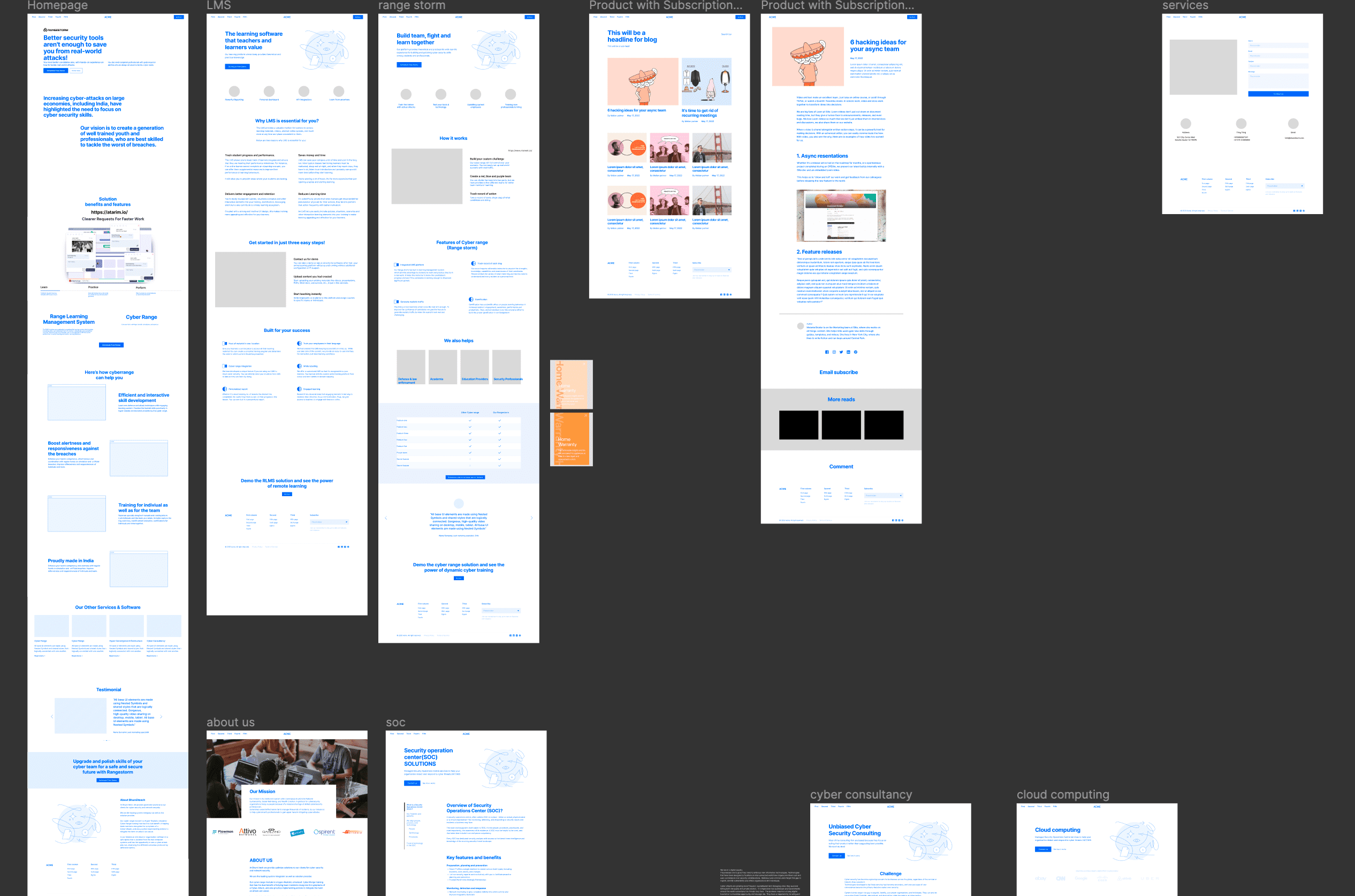
It took around 20 days to write content and create a website wireframe.
Now we are finally ready for…..
Visual design
The biggest problem while choosing visuals was I had to design with scalability. It means in future we will also use the same colour and style guide for our other products.
To jumpstart visual design work, I created a mood board that evokes emotions.
These emotions are decided in a meeting with stakeholders
- Clean
- creative
- Futuristic (Techy)
- Inviting(engaging)
- Professional
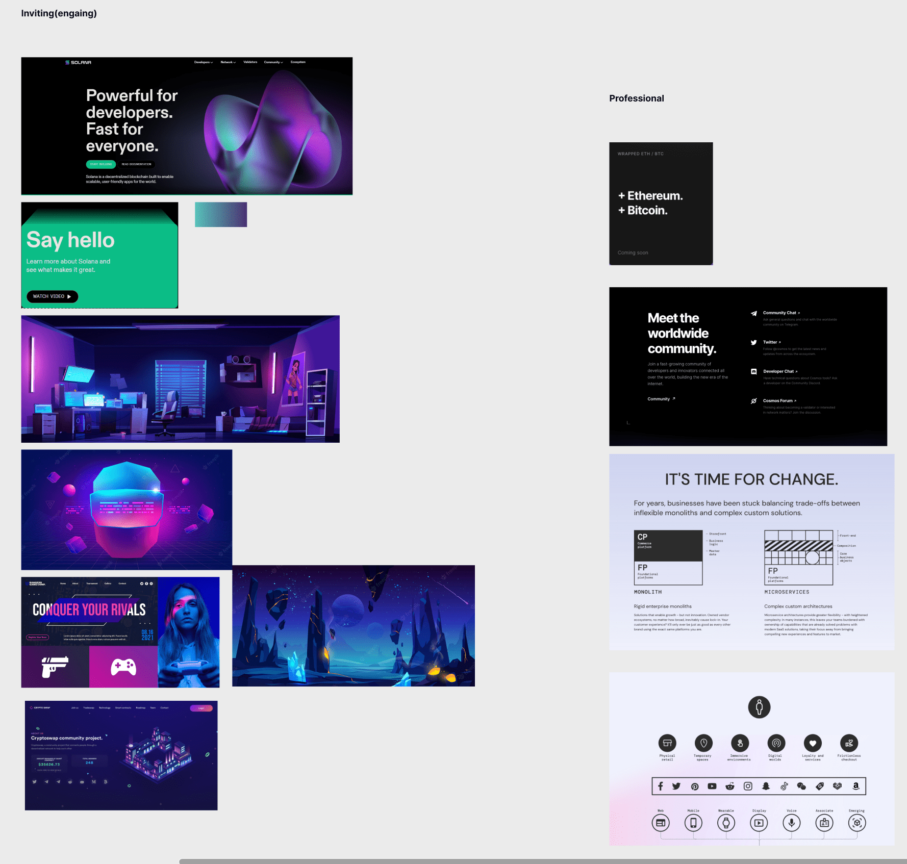
After getting feedback on the moodboard, I started to playing around with some color and layout to see how everything fits together.
For that, I did lots of experiments and here are some of the outcomes of that process.
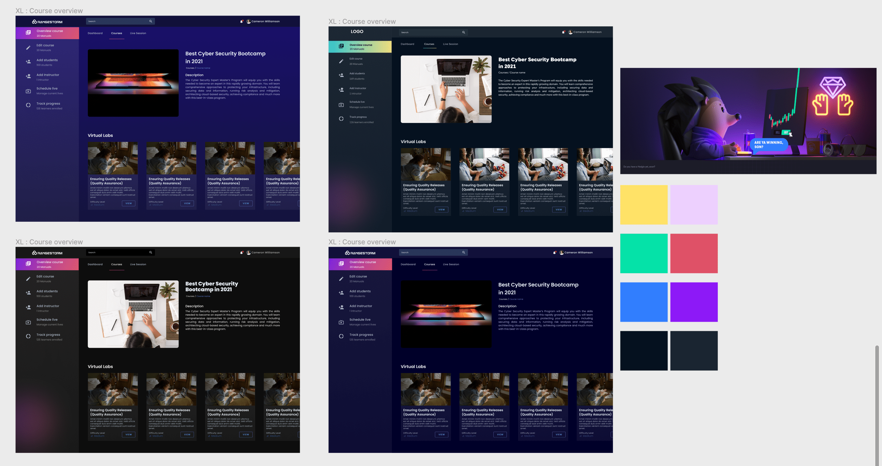
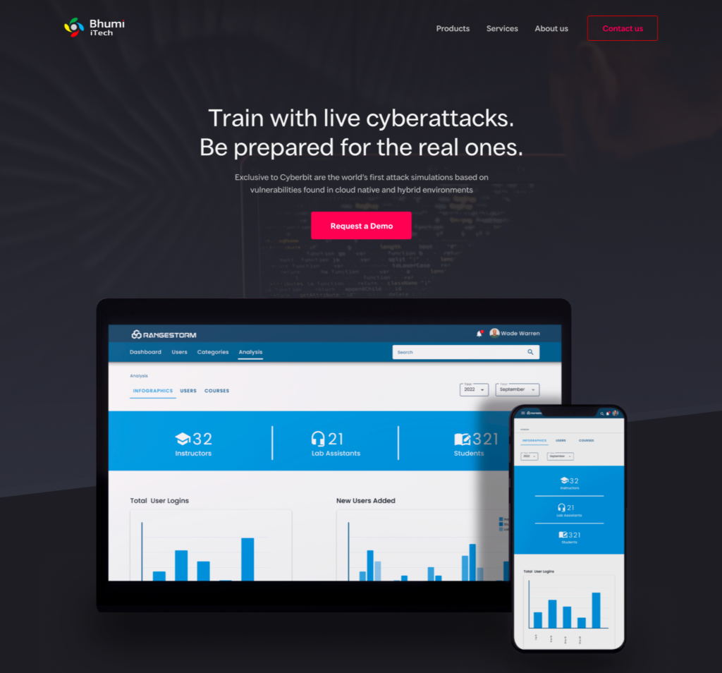
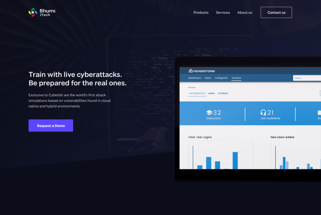
The design didn’t get approved
After doing lots of iteration of the website and other visual elements, when I showed the website to stakeholders, they didn’t like the design.
Their feedback was as follows:
- Too static & boring
- It was not looking engaging
- Not looking unique
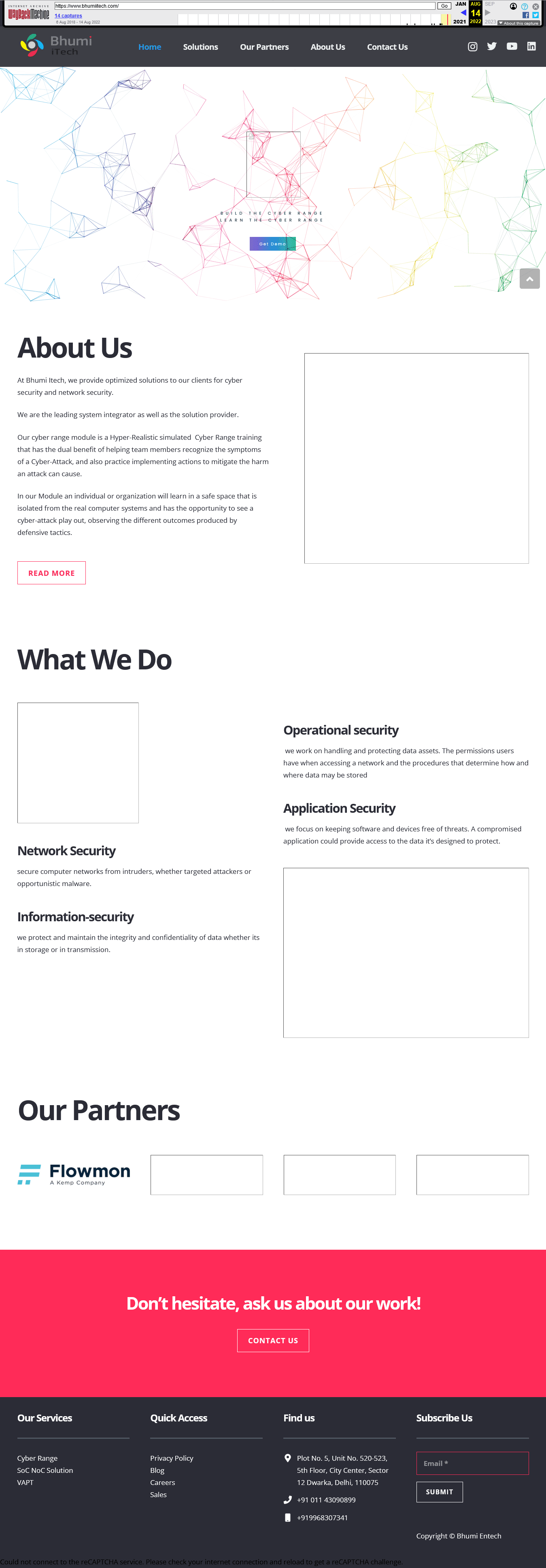
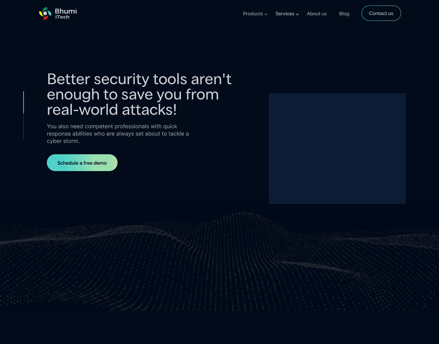
Finally, we then decided to use the 3D design on the website.
This is what the final design looks like:
Final outcome & lessons
Since our company was very tight on budget, the development of the website didn’t go as expected.
Even in the last stage, we adjusted the final website.
We also lacked a highly skilled motion designer, so we made some compromises with the video.
Overall, even after many obstacles, every stakeholder was happy with the outcome and made the website live.
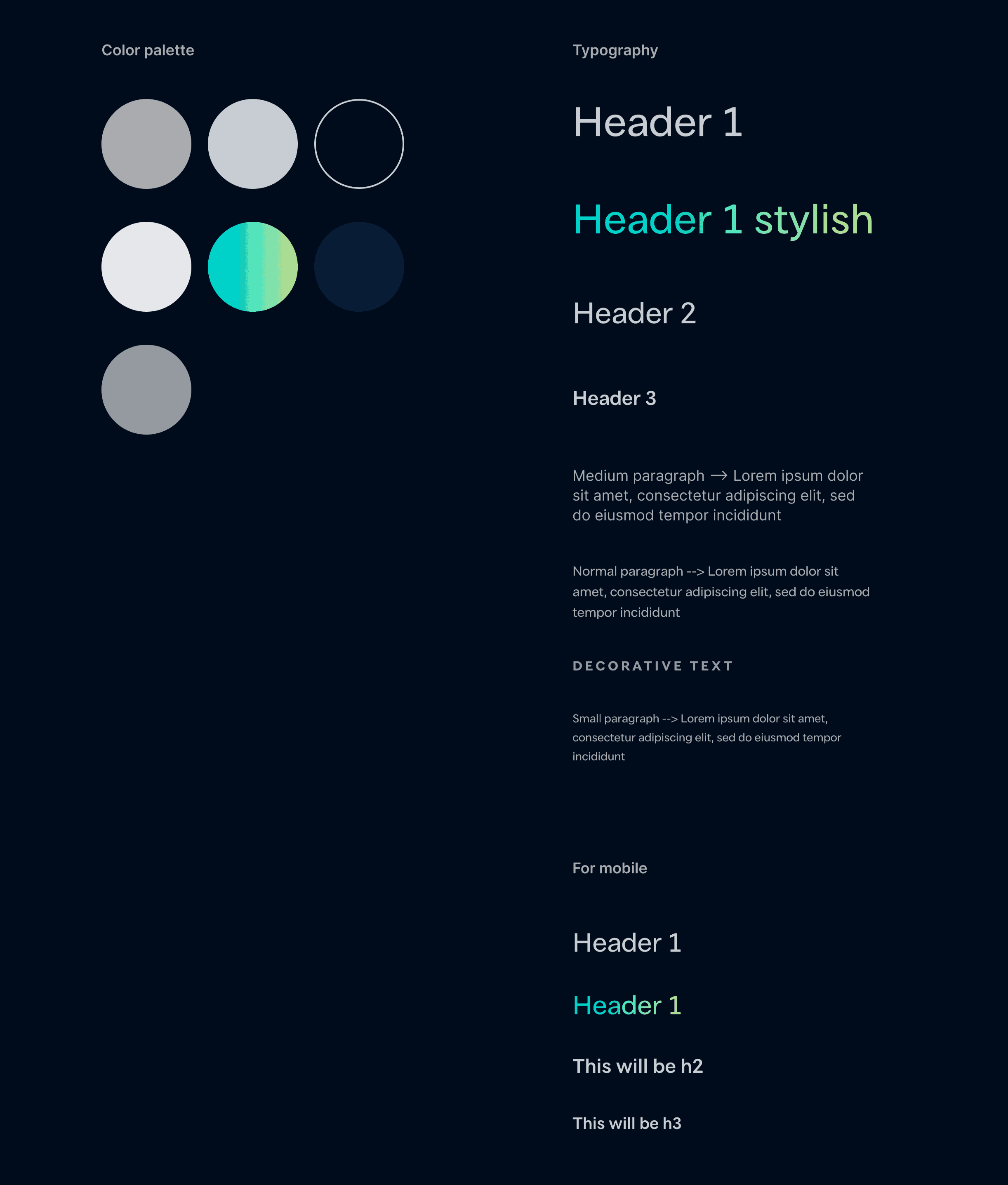
I handed over all assets with the final style guide of the website.
Finally, we reached the end of the case study. If you have any doubts or want to ask a question. Write to me at [email protected]
