
I was thinking of writing this article for the last year, but I am not sure what was resisting me from writing this article. Maybe being a designer, I don’t want to offend other designers too.
Or maybe I don’t want to look highlighted by making the design community get angry at me.
The reason could be anything, but I can’t control myself writing about this because most people are doing it wrong—it doesn’t matter it’s an agency or a freelance web designer.
Until we don’t talk about it, we will keep making the same mistake again and again, especially the new designers who are starting their carrier.
This article is helpful for both client as well as designer.
If you are a designer, this article will help you understand what a good design is.
If you are a client, this article can save you a reasonable amount of time and money. As well as help you know who is a real designer and who is a fake one!
Are you excited to get started?
Let’s understand what I am trying to say.
Before talking about anything else, let’s talk about types of the design.
There are two types of design:
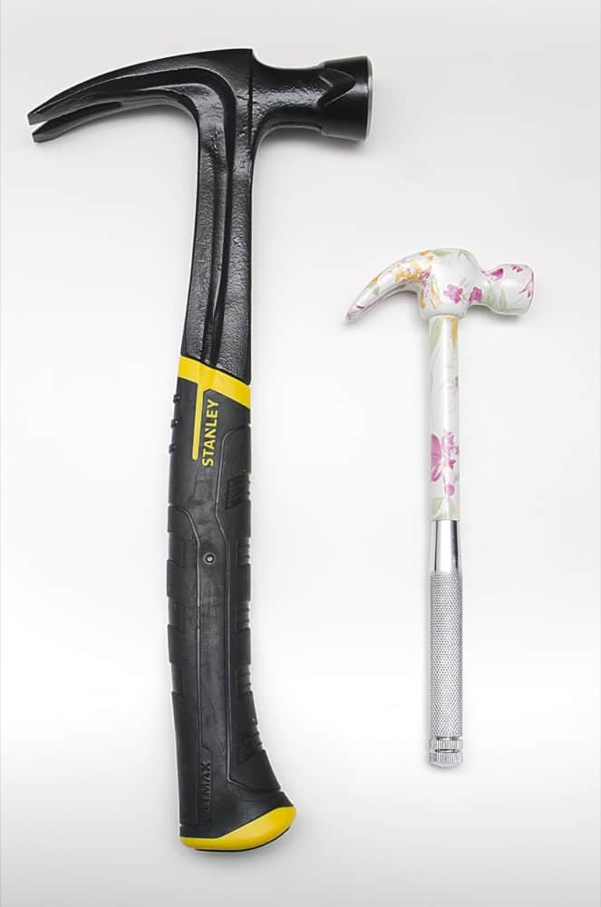
For Aesthetic purpose: Baby hammer(Right side in the image) represents good design to people who believe that design means “optimize for beauty.” although you can’t use it for hammering, it just for show off.
For Functionality purpose: The Stanley hammer(left one) represents good design to people who believe that design means “optimizing the product’s core function”. You can definitely use this for hammering purpose
Most agencies and designers design for beauty rather than understanding customer and business goals.
Wikipedia and craigslist is an excellent example of functionality over beauty in real world.
Below is the screenshot of the design made by an agency for their client. As you can see, it’s purely made for beauty (you can’t read the text correctly, colours are too distracting, the layout is breaking the design law etc.)
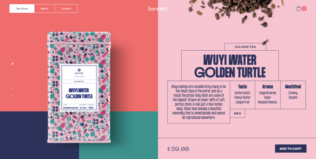
On the other hand, Below is another website(which sells tea), but they focused on making it functional, not beautiful even though it’s looking good.
More than half of the client falls into this trap. They see the portfolio of a designer or agency. And Rather than asking a question about the process and other business-related questions.
They end up hiring them by seeing flashy landing pages in their portfolio.
In my opinion, good web design means understanding your visitor and business goal, then designing the product considering both goals. This is the real definition of functional design.
An understanding goal doesn’t mean making assumptions; I still see many clients who pretend to know their audience. They suggest changing the website’s copy, and when we do the A/B test, the results never increases.
Be aware of it by “understanding goals” means understanding the goal, not making assumptions about customers.
I am not against beauty at all.
Designers who are reading this post may be thinking that I am here to make them realize that their work doesn’t make any change.
You are getting me wrong, my friend!
It’s OK to optimize for beauty if your insights(market research, customer research etc.) tell you that your visitor will buy more as a result. You should absolutely test with making the design beautiful.
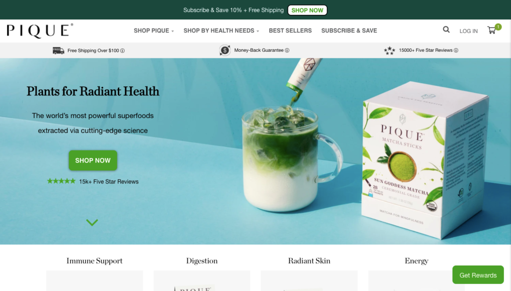
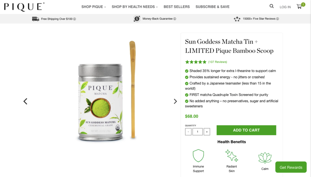
For example, piquetea.com know to sell their product, it’s essential to make the design look beautiful to increase trust and product value in the customer mind.
At this point, functional design and aesthetic design become the same because we are thinking about the goal of our visitors and our business.
One of the most important things you have to be aware of is aesthetics is not a substitute for research and testing.
If you made your website without research, it is similar to the baby hammer shown above in the image.
Why not design for function and aesthetics in a website?
This is the most common question people ask when they hear about functional and aesthetic design.
Can’t we stay in the middle of both?
The question is entirely acceptable because who doesn’t love the beautiful design. But the problem is designing for beauty is like asking an “Athlete to run in a high heel”.
He/She can run fast without heels, then providing them heels will only slow them down.
Here is some reason why beauty is terrible for your design:
- You have to write extra code for doing any editing and A/B testing of the design.
- It can increase the server load and another technical issue.
- Need more time to do the simple things. For example, editing a simple Wikipedia page is much easier than editing a beautiful site.
If you want to make your website more beautiful, ensure your designs are minimalist(I mean simple)—visually and technically.
Keep them elegantly simple and easy to update. And don’t forget that like the Stanley hammer—an excellent functional design has a beauty of its own.
And a good designer design for functionality not for beauty. Still have questions let me know here
